Part 2: Pandemic ahoy!
Winning a portfolio review from Donna was a step out of my comfort zone. But I needed a poke and I didn’t know what I might actually get out of it. Hopefully, some direction, what to watch out for or where my strengths and weaknesses were.
When Donna arranged for me to meet Maryann from Wild Dog Books, I was a bit overwhelmed. Finally, the negative self-talk was shut down and there was silence. What a buzz. Is that what confident people get every day?!?
Maryann loved the infographic work I’d been doing, and liked my style. So I was asked if would I be interested in illustrating Carole Wilkinsons book for primary aged children about climate change? Would I be able to do it on a short timeframe, as it’s going to be taken to Bologna in May? Yes and YES! - try and stop me!
But low, what is that on the horizon? ...Ruby Princess.
I heard nothing more about the book. Problems with the printers. Bologna cancelled. Small beans really, people were dying.
But after the first shutdown in Melbourne, we were able to get started. Donna will be the book designer and hold my hand through the process. YAY!
I began by reading the text and talking through each page with Donna from the layouts she had sent through.
With a lightbox and each page, I sketched and placed what went where. Larger full-page infographics were given special treatment. Some, I had to do sums on!
The infographic work I’d done in the past was faceless - that is each of the little characters I drew had no facial features. I thought about changing this, but came to the conclusion - it wasn’t a narrative and I didn’t want to comment or provide any editorial on what any reader might interpret from the text. Just the facts.
Each of these were then photographed with the iPad and sent as a PDF for Donna to check and send feedback.
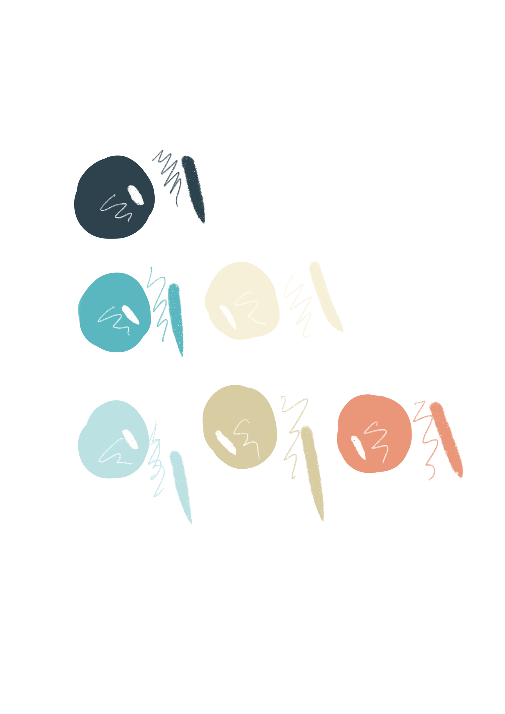
While waiting I looked at colour palettes, one of my favourite things to hunt around for. I like muted tones with a retro feel but I did need a dark - but not black - and I wanted it not to be gendered. Setting myself a palette keeps everything consistent and cohesive throughout the book.
To help, I needed to see it in a picture so picked a page and did three different colour versions. We all liked the same one *phew*
Shutdown 2 became imminent.
I packed up my lightbox, some paper and pencils, my iPad and set up at home to do it all in Procreate.
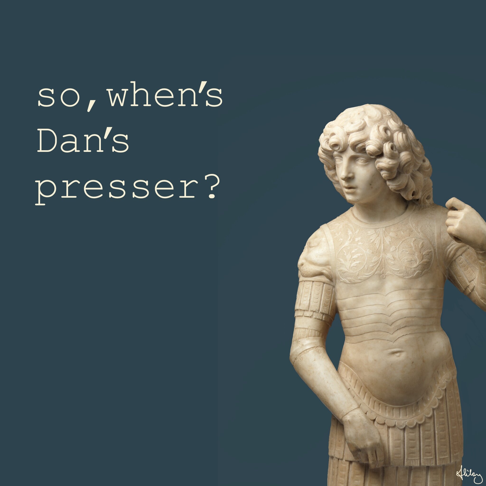
We watched Dan’s presser every day.
As each page was approved I worked up a set of colour roughs.
I set the page size in Procreate and photographed the rough. Laying the image on the artboard on the iPad. Making it 50% transparency and drew the finals over, just like tracing on the lightbox but straight into the drawing program using an Apple Pencil.
We watched Dan’s presser every day.
While waiting for approval, I made a few images to post as a small way of channelling some lightness past peoples eyes as they doomscrolled.
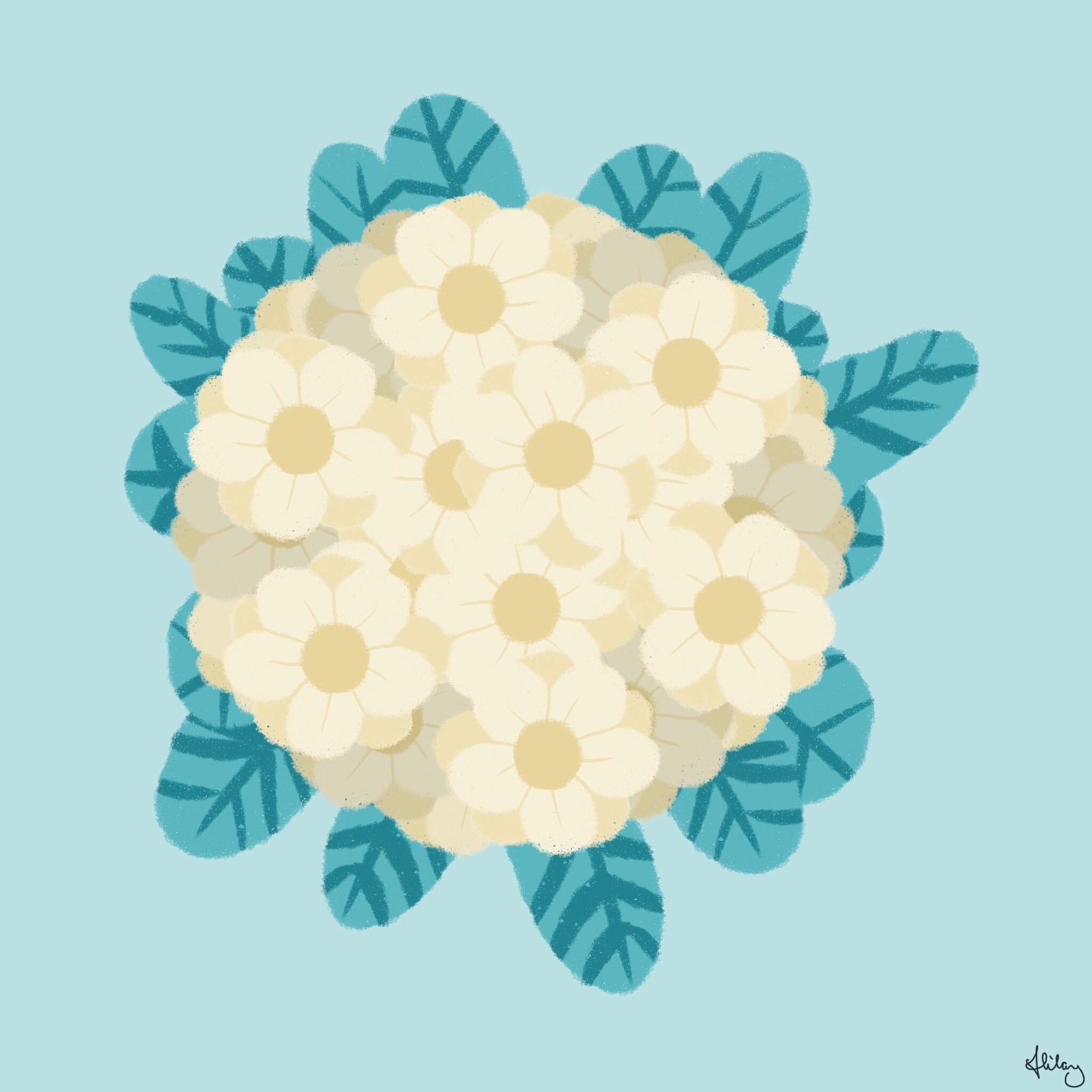
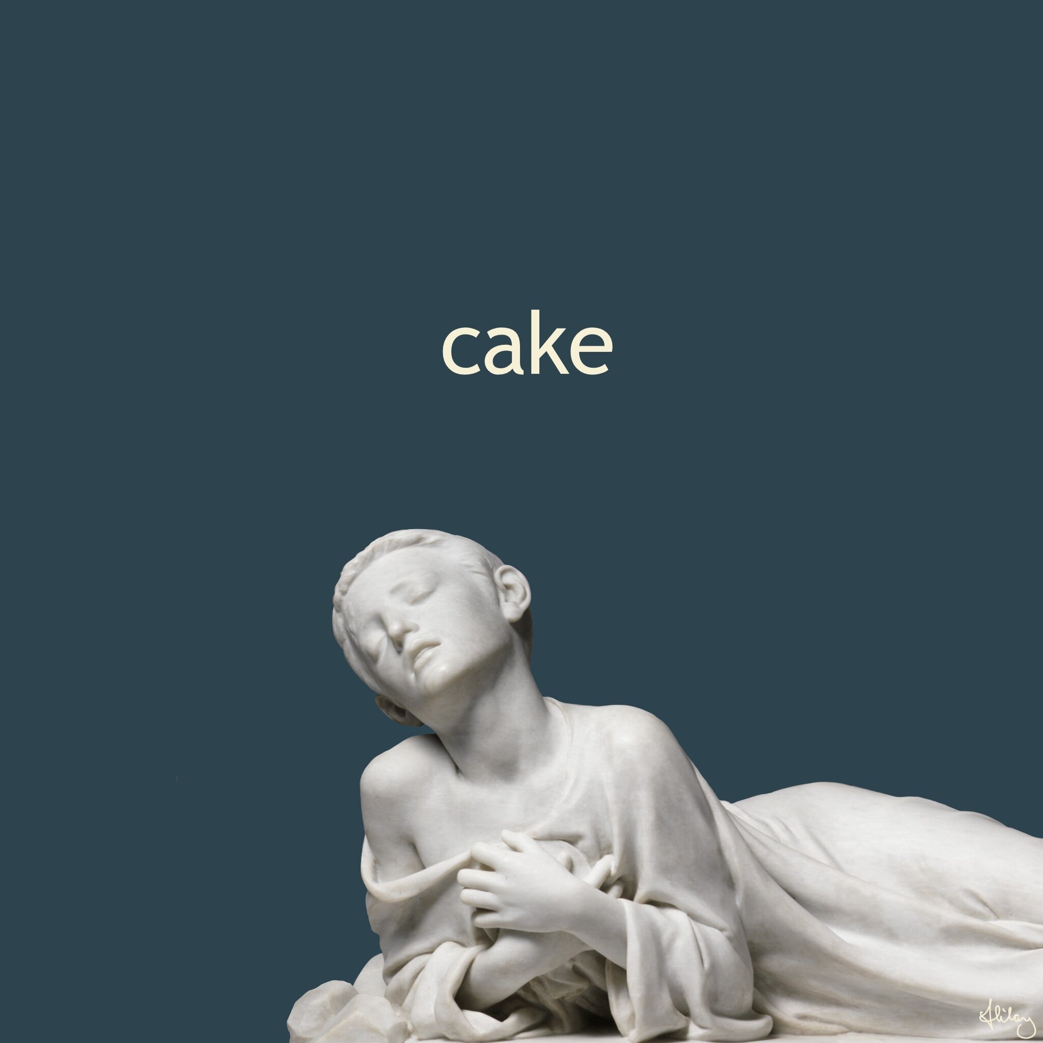
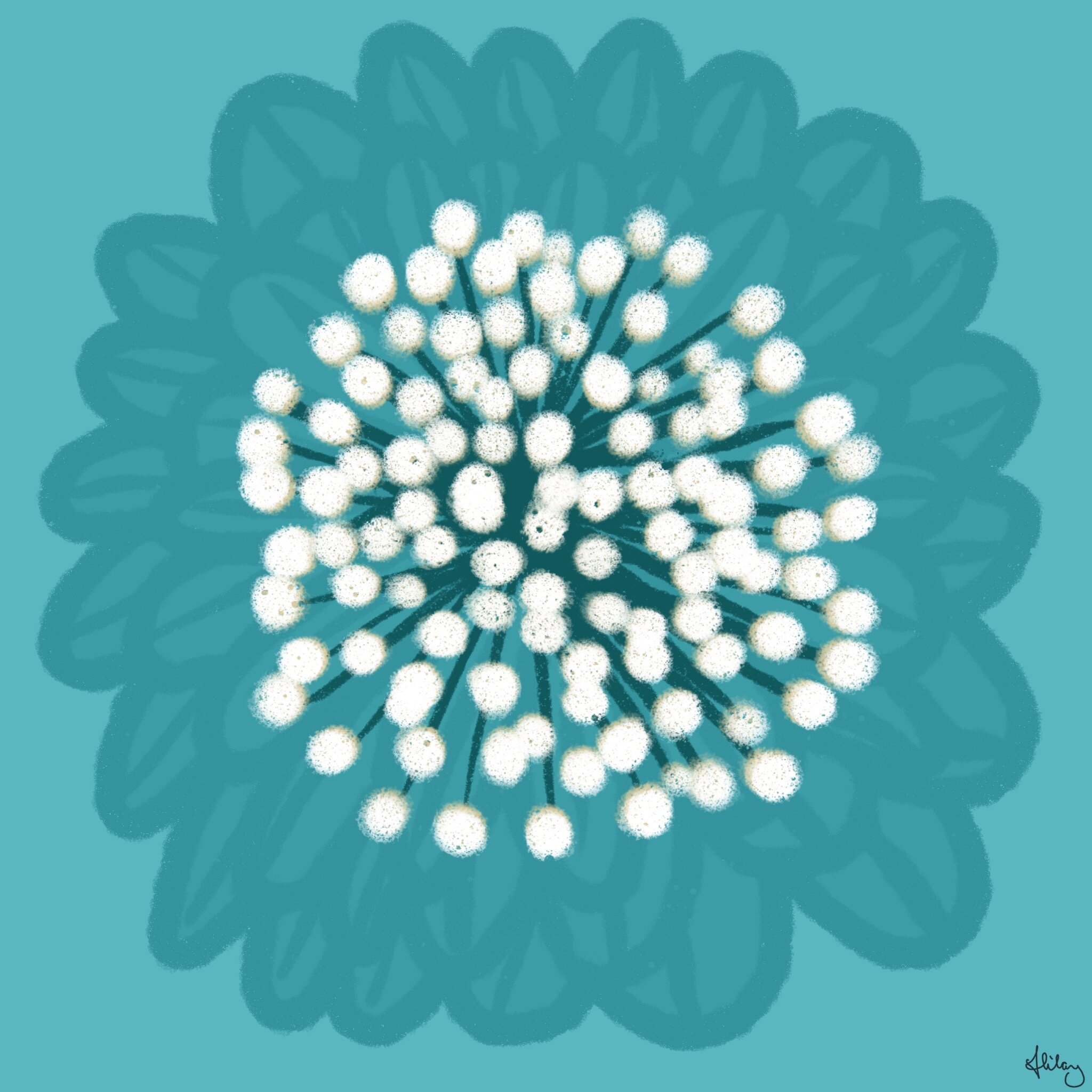

There were a lot more, which you can’t find on my instagram, as well as some colouring sheets which you can get here
As the colour roughs were approved, I finessed and tidied the images.
Phone meetings with Donna were like a little bit of light, someone different to talk to, something new to focus on. They were long rambling chats and I needed it.
Text was edited, layouts changed, more roughs were drawn.
We watched Dan’s presser every day.
My fancy printer was at the studio and with the shutdown, we were discouraged from going, and can I just say - it was a bit scary in and around the city with only a few people, one coffee shop and police roaming around.
I trusted the technology and I trusted Donna, and I was right to. It worked. Donna did an amazing job and we all deserve a nice cup of tea and chocolate biscuit or something cold and sparkling to celebrate.
Oh, and by-the-by, I picked up my single advance copy right before Shutdown 3.

And it looks great :)
